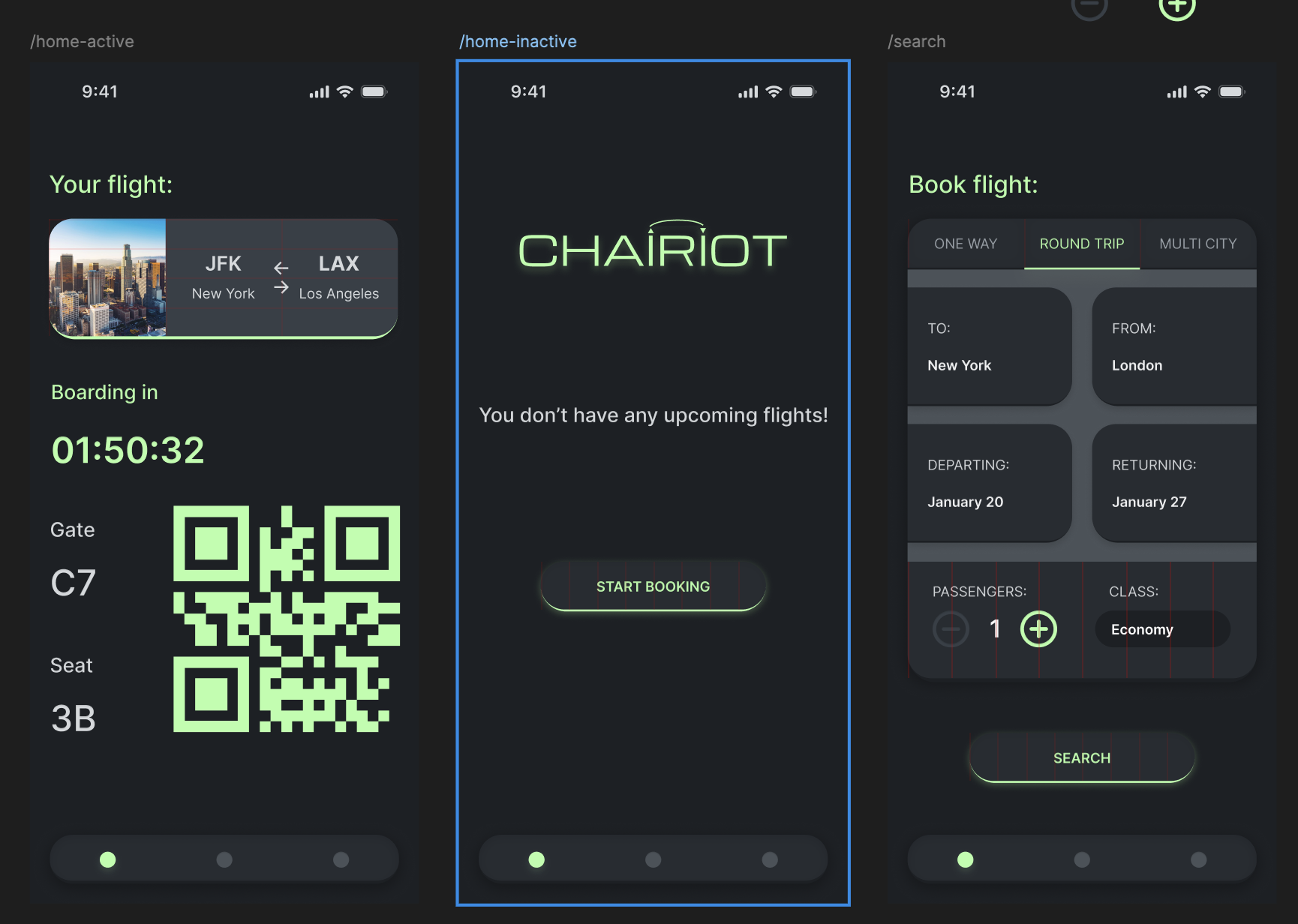
IxD — Accessibility + Airline App Design Process
Reading about inclusion and accessibility informed me about the different impairments people may have. Considering and accommodating for various types of impairments can create a better experience for the entire audience, for example using typography accessible to people with dyslexia can improve overall legibility and readability for all users with or without similar conditions. Designing with color blindness in mind may improve differentiation of colors for other non-colorblind users.
I believe other factors should be considered in designing, for example how members of certain generations may expect differing features or methods of navigation in experiences because of the technology they have been accustomed to. Younger generations have grown up using tablets and smartphones, so they typically view their devices through a more containerized lens (everything is its own “app”).
Working through my airline project, I wanted to be situationally aware. Users at an airport will most likely be opening the app to view their current flight info, so I made the welcome screen a flight overview. If they do not have an active flight, the welcome screen invites them to book a flight. Stylistically, I wanted to move past the now-standard flat style to a more skeuomorphic flavor. The style I am using is closer to Neumorphism, however I am moving away from the low-contrast look that gives Neumorphic UI the nickname “Soft-UI”. Reading about accessibility affirmed my design choices in this project and will heavily influence new projects, especially when it comes to color and typography.
