Webpage Dissection
Bad Design
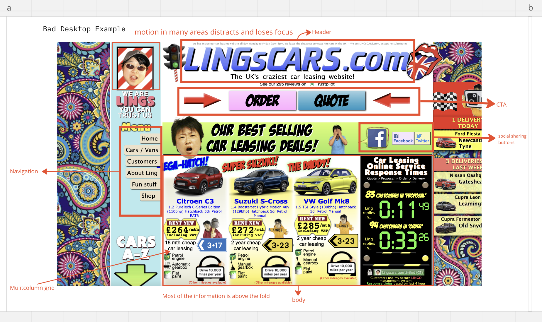
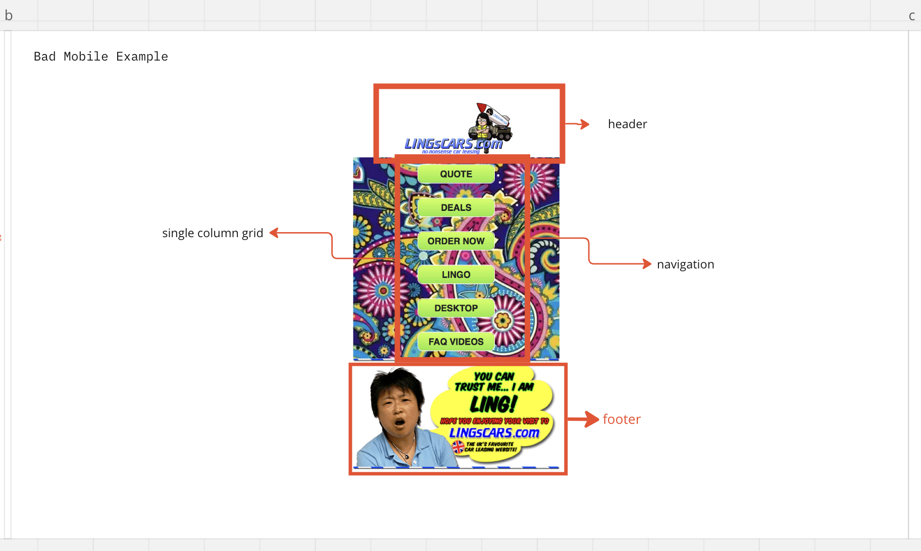
Our team’s bad website example demonstrated many reasons as to why a website could be considered bad.
The website heavily utilized animation in many different unrelated areas, causing the user’s eye to jump around to anywhere but the key information.
There was little to no consistency in the design language. The website often used random imagery just to use it instead of only using elements that supported the user’s navigation.
Good Design
Our team chose Nike as a good website example as it was relatively familiar to us all.
We noticed its use of a hero image, and simple navigation that was always visible. There was a menu bar, elements were large and image-dominant.
The simplicity of the site left little to complain about. The focus on important elements and navigation created an easy-going experience for users.


