About
Bobcats is a rebranding of the Las Vegas Aces, moving away from a ‘sin-city’, gambling-oriented connotation. Bobcats goes out of its way to distance itself from the hyper-masculine and beige sports market.
WORDMARK + LOGO
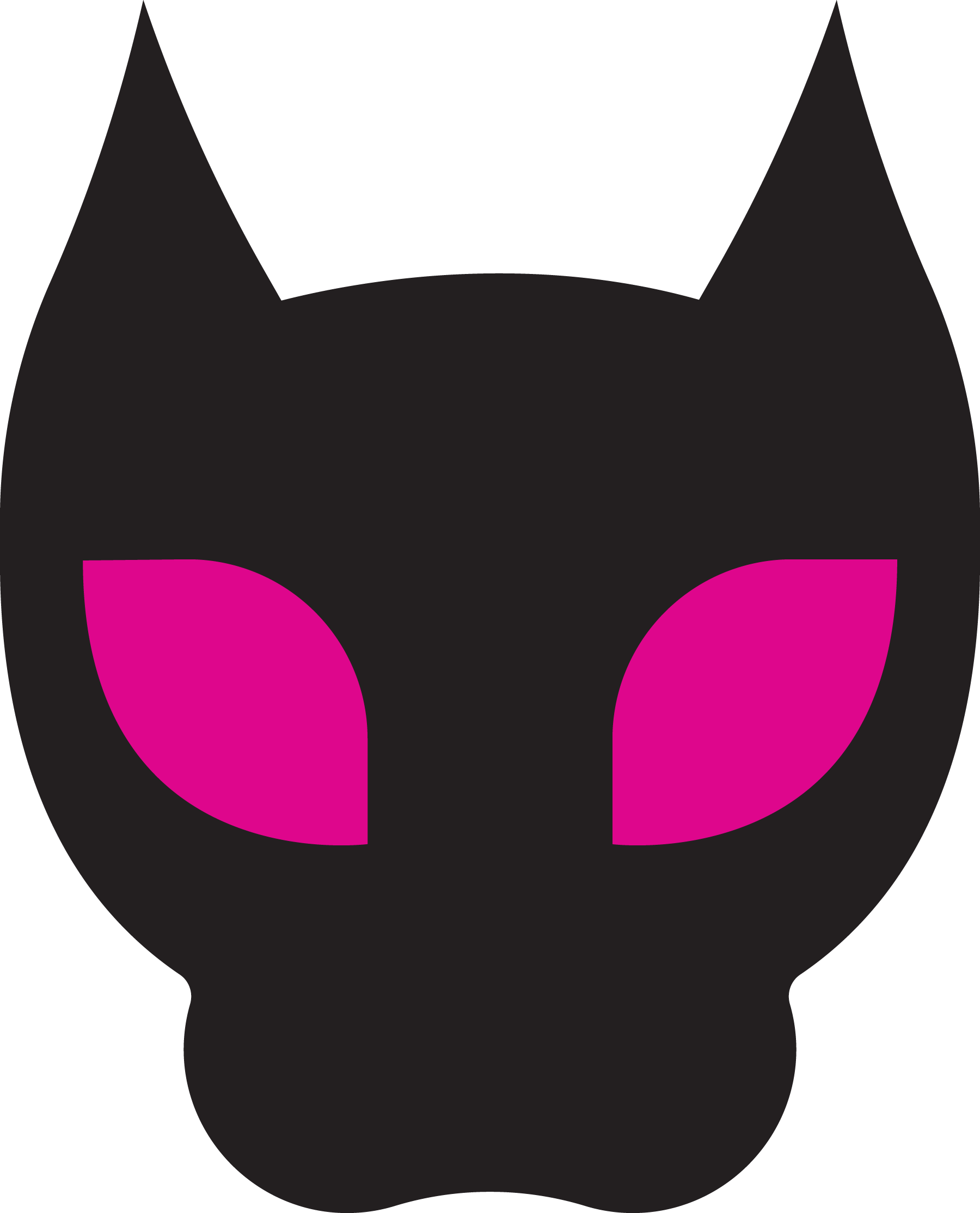
The logo illustrates a bobcat, with bright pink eyes that breathe both femininity and intimidation into the brand.
The wordmark mimics the logo as its first letter ‘B’ and last letter ‘S’ give the mark pointed ears. the ‘O’ and ‘A’ mimic the shape of the eyes in their counter-forms.
COASTER
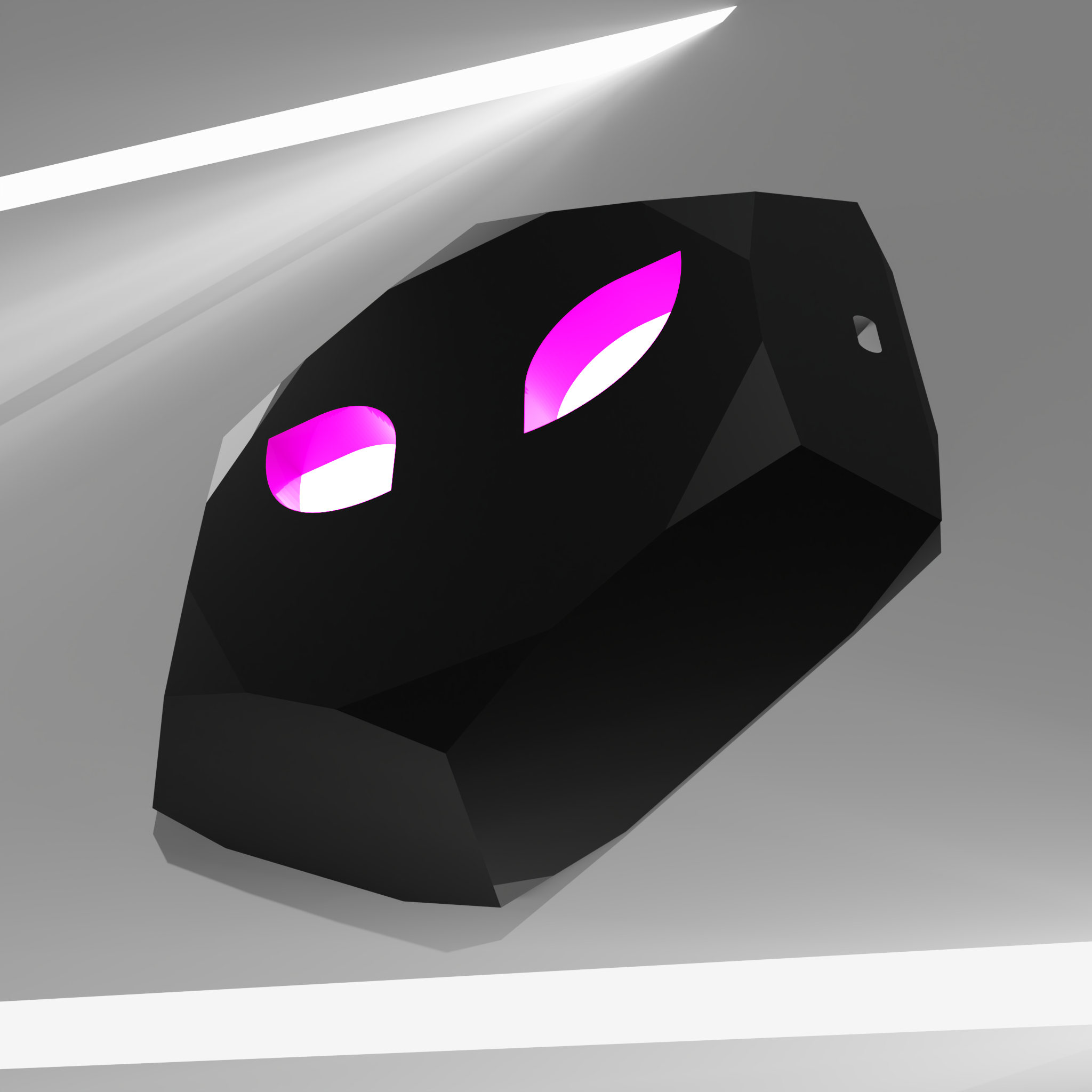
In the Bobcats home arena, coasters that light up your drink from the bottom can be seen and sold at the bar.
Coasters are rechargeable via USB-C.
CAT-EYE PALETTE
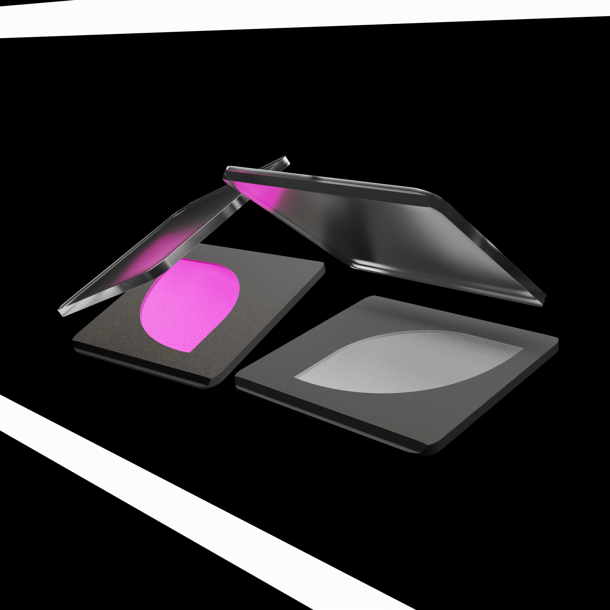
The most subversive of the products are the Cat-Eye Palettes: An pair of eyeshadow palettes holding the team colors. As a sports team, having a stereotypically feminine product is quite defiant. This doubles down on the teams femininity while making eye makeup fun and festive for all gender expressions during Bobcats sports events.
CAT-EYE GLASSES
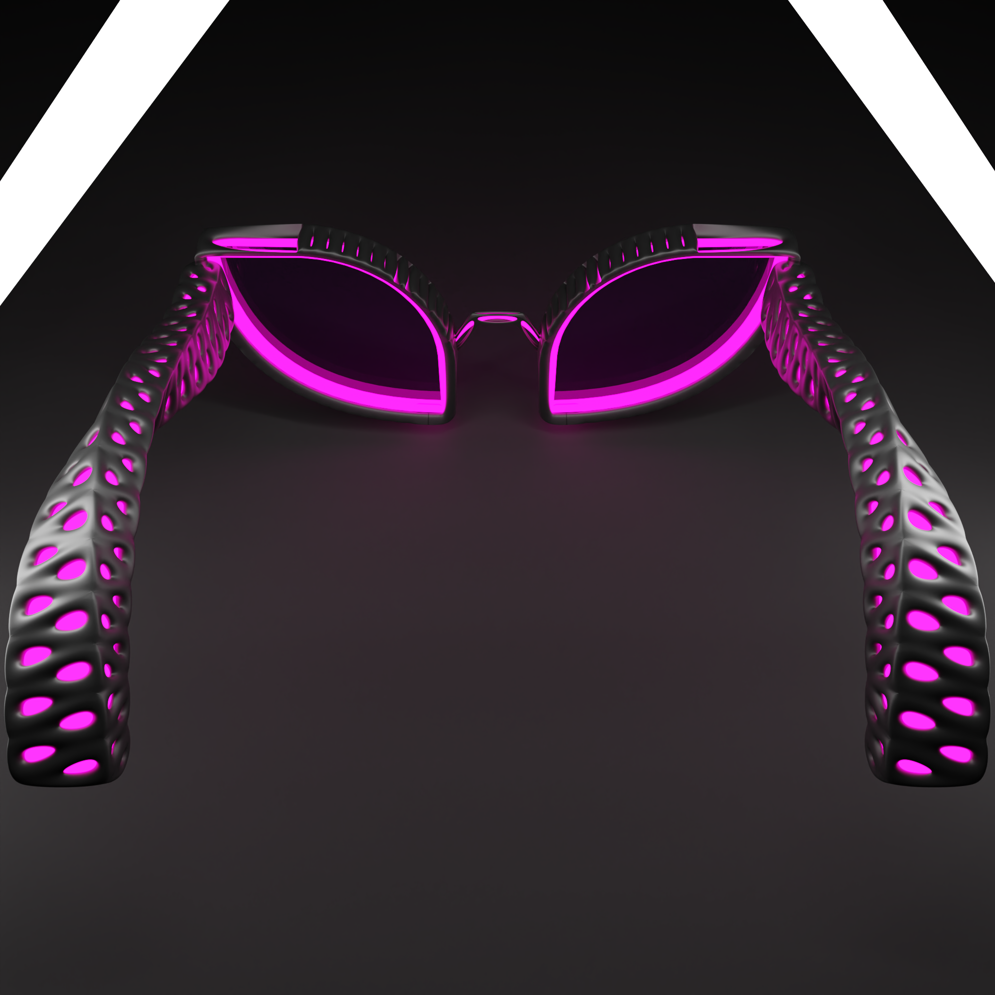
The glow-in-the-dark Cat-Eye glasses are an attention-grabbing way to show support for the team.

